
Decorative papers (such as melamine-impregnated paper, PVC films, and real wood veneers) are widely used surface materials in modern interior design, commonly applied to furniture, walls, and cabinetry. Proper matching can enhance both aesthetic appeal and functionality. So, how can you combine decorative papers to achieve the desired renovation effect? This article provides practical advice on style selection, color coordination, material combinations, and real-world applications.
Choosing Decorative Papers Based on Interior Style
Different interior styles suit different textures and colors of decorative paper. Thoughtful selection ensures overall harmony.
1. Modern Minimalist Style
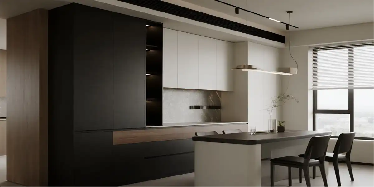
Recommended Papers: Solid color matte melamine paper, metallic-finish PVC film, wood-grain paper (light oak, ash)
Key Pairings:
- Dominant palette: Black, white, gray, with subtle accent colors (e.g., muted tones like Morandi shades).
- Avoid intricate patterns; prioritize clean lines.
2. Scandinavian Style
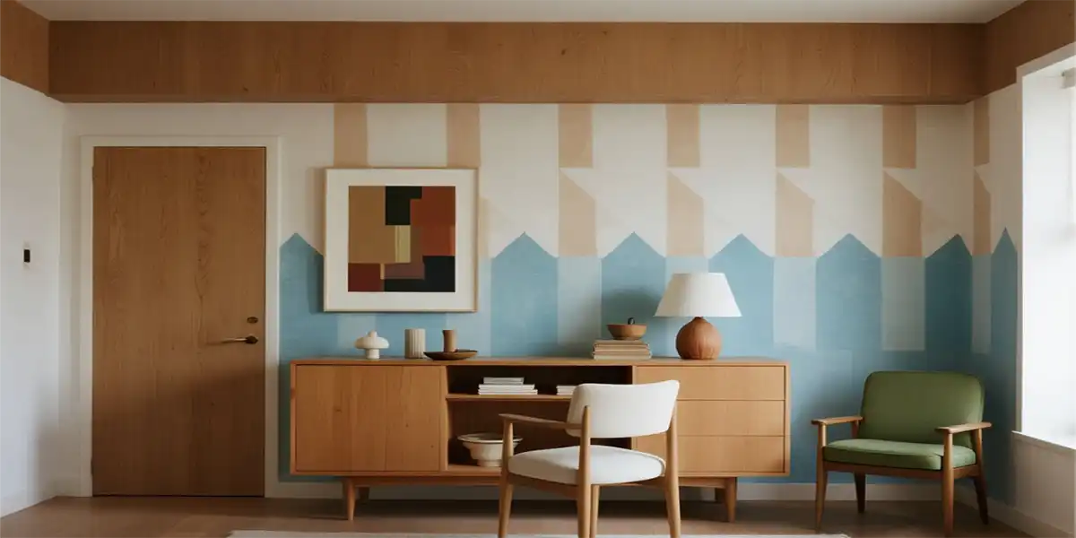
Recommended Papers: Light wood-grain paper (white oak, maple), geometric-patterned wallpaper
Key Pairings:
- Natural wood tones + white, with soft pops of color (e.g., dusty blue, avocado green).
- Consider textured papers mimicking linen or burlap for an organic touch.
3. Industrial Style
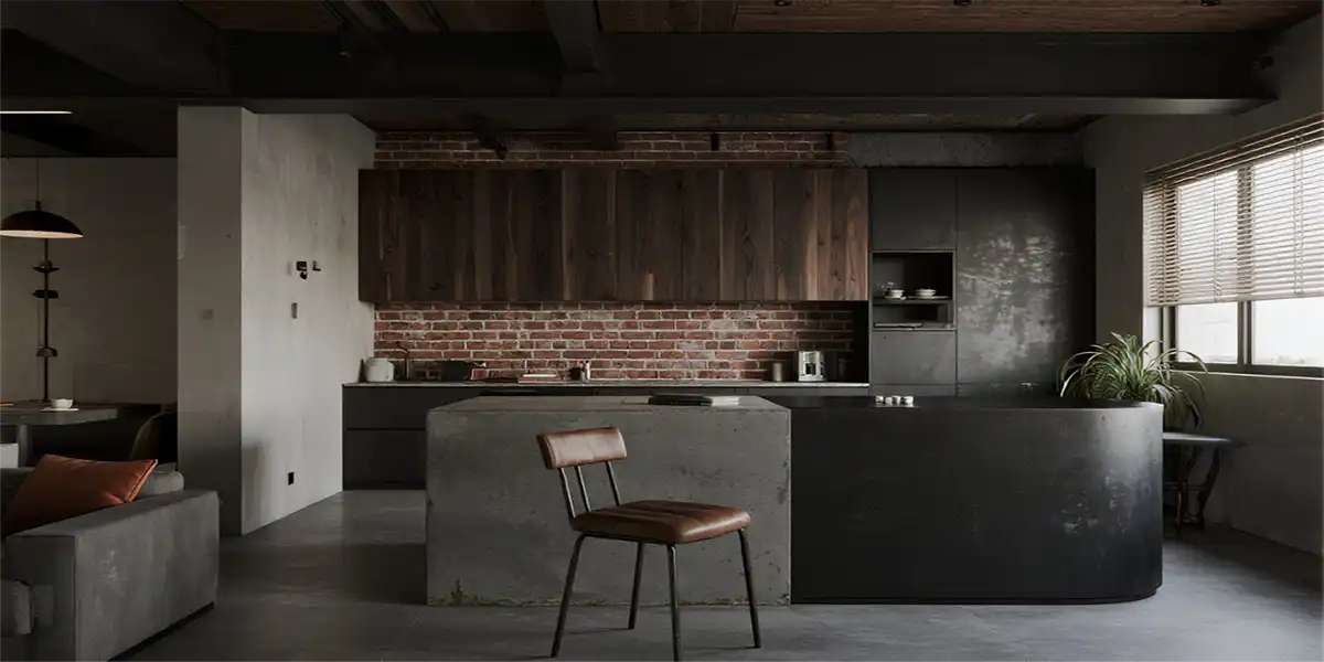
Recommended Papers: Concrete-effect paper, distressed metal films, dark wood grains (walnut, black oak)
Key Pairings:
- Deep grays and blacks, paired with exposed metal elements.
- Localized use of brick-pattern or rust-effect papers adds authenticity.
4. New Chinese Style
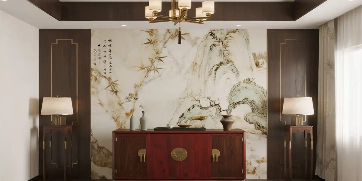
Recommended Papers: Dark wood grains (ebony, mahogany), landscape or marble-pattern wallpaper
Key Pairings:
- Rich browns and redwoods, accented with gold or brass metallic lines.
- Rice-paper textures or calligraphy-inspired designs enhance cultural depth.
Color Coordination Techniques
The color of decorative paper directly impacts spatial ambiance. Strategic combinations elevate the design.
1. The 60-30-10 Rule
- 60% Dominant Color (walls, floors): E.g., light gray, beige, natural wood.
- 30% Secondary Color (furniture, cabinetry): E.g., charcoal, walnut.
- 10% Accent Color (decor, soft furnishings): E.g., forest green, caramel.
Examples:
- Modern: 60% white (walls) + 30% charcoal (cabinets) + 10% gold (hardware/lighting).
- Scandinavian: 60% light wood (floors) + 30% white (furniture) + 10% dusty blue (pillows/curtains).
2. Monochromatic Gradients
- Use varying shades of one hue (e.g., light gray → medium gray → dark gray) for layered sophistication.
- Ideal for minimalist or Japanese styles.
3. Contrast Pairings
- Warm-cool contrasts (e.g., navy + light wood) suit modern or industrial spaces.
- Timeless black-and-white schemes work for luxury or ultra-minimalist designs.
Material Mixology: Elevating Design with Texture
Single materials risk monotony. Combining textures adds depth and luxury.
1. Matte + Gloss Finishes
Matte melamine cabinet doors paired with glossy PET film handles create refined detailing.
2. Wood + Stone Effects
Kitchen countertops with marble-pattern paper + walnut-grain cabinetry evoke organic elegance.
3. Fabric-Like + Metallic Accents
Walls with linen-textured paper + metallic-framed art elevate tactile richness.
Practical Application Examples
Case 1: Custom Wardrobe
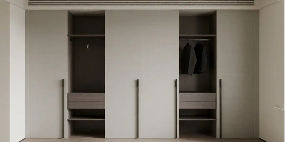
- Carcass: Light gray matte melamine.
- Doors: Fabric-effect paper + black metal handles.
- Result: Timeless modern simplicity.
Case 2: TV Feature Wall
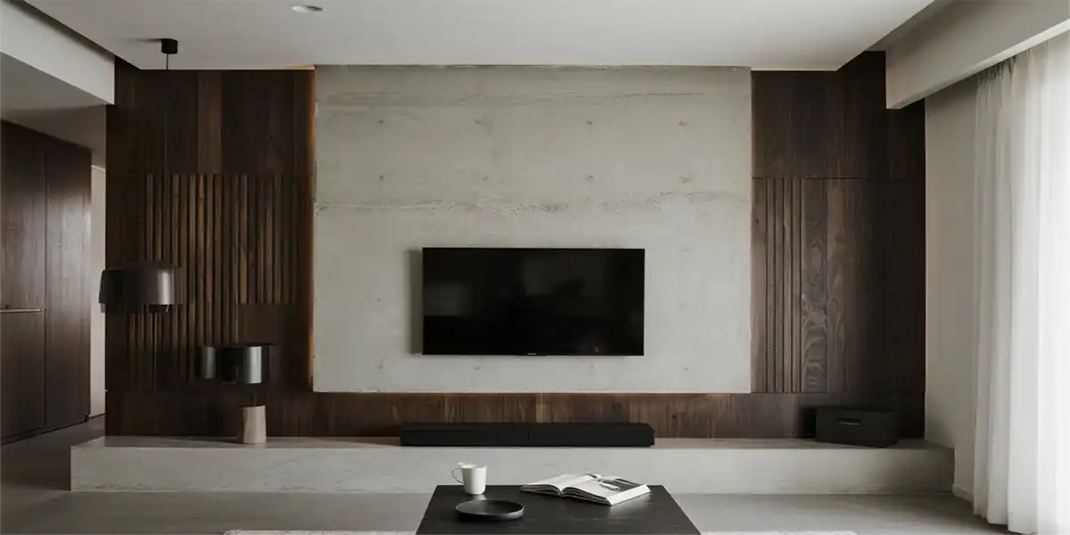
- Main Wall: Concrete-effect paper.
- Accent: Dark wood slats.
- Result: Industrial-natural fusion with bold character.
Case 3: Kitchen Cabinetry
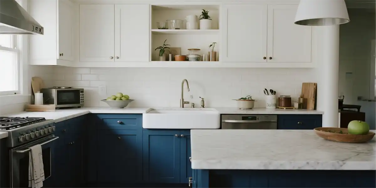
- Lower Cabinets: Navy matte PET film.
- Upper Cabinets: White glossy melamine.
- Countertop: Quartz-pattern paper.
- Result: Fresh, clean Nordic aesthetic.
Pitfalls to Avoid
- Overusing High-Gloss Papers: Can appear cheap and cause glare.
- Busy Patterns in Small Spaces: Creates visual clutter.
- Lighting Considerations: Colors shift under natural vs. artificial light—always test samples.
Conclusion
Mastering decorative paper pairings blends artistry with strategy, balancing style cohesion, material interplay, and chromatic harmony. Even budget-friendly materials can yield high-end results when thoughtfully combined. Use these guidelines to craft a home that reflects your ideal aesthetic effortlessly!


Leave a Reply
Want to join the discussion?Feel free to contribute!